
Design Thinking = Problem Solving
This project took place in 5 nonlinear phases in adherence with the design thinking process:
Empathize > Define > Ideate > Prototype > Test
When starting this project, the question I asked was: how can we improve the user experience of taking public transportation in one’s own city? How can I solve this problem with design thinking?
To tackle this issue, I had to take the first step: empathize with transit riders. What problems do they face that can be solved with better UX?

Planr: A Public Transit Planning App
As the UX Lead in this ~5 month Springboard project, I created PLANR, a prototype iOS application that allows public transit riders to easily plan public transit journeys and save the trips, stops, and stations they rely on most.
This is my most comprehensive project to date, in which I commanded every aspect of the UX process, from research (generative, user, and usability) to design (ideation, prototyping, iteration) and branding (style guide, color palette, UI).

Phase 1: Empathize (Research)
I conducted my empathize / research phase in two parts: secondary research and user interviews.
First, I reviewed existing transportation apps, including local apps (i.e. Portland, NYC) and more popular apps like Google Maps and Transit. I also reviewed best design practices for transportation apps.
Then, with an understanding of the transit app space under my belt, it was time to do some user interviews of my own!
To recruit participants, I took to my local metro station during rush hour on a weekday evening. There, I passed out flyers with a QR code that linked to my screener survey (Selected users received a $15 Amazon gift card for participating). I also shared my screener survey online through the Springboard student Slack channels.

Recruiting research participants at the DC metro.
My goal with these interviews was to understand everything about riders’ process, context, and mental state when taking public transportation. I went into this research assuming I knew nothing!
In total, I interviewed 7 participants via Zoom - 3 DC residents and 4 Springboard students. All interviewees were city or suburban dwellers who took public transportation at least sometimes.
Phase 2: Define (Synthesize)
After conducting 7 interviews, I had over 3.5 hours of recordings and 18 pages of notes to understand users + the problem space. To synthesize my findings, I created an affinity map, an empathy map, and 3 personas of transit riders.
From the affinity + empathy mapping, I identified the following themes that would be the focus for my designs:
These findings led me to 3 How Might We Questions that would guide the rest of the project:
How might we plan efficient journeys on public transportation (PT)?
How might we provide realtime arrival, departure, + delay information to riders?
How might we account for multi-modal transit when mapping and planning a trip?
Mapping vs Planning
Mapping is figuring out how to get there, while planning is figuring out when to leave so you get there on time.
For regular transit users, planning was what they did most - not mapping.
Need for Live Updates
Nearly every user I spoke with mentioned that live, accurate information is critical to their planning.
This could make or break their experience.
Account for multi-modal transit
People often take at least 2 types of transit to get from A to B (i.e. bus to a metro station).
Existing apps don't account for this well enough.
Phase 3: Ideate + Refine

Sticky notes on the wall - the best ideation technique!
Ideation is a divergent process, meaning it is a time to think of any and every possibility to address my HMW questions. I set a 1 hour timer on my laptop and wrote down as many ideas as possible. At this phase, no idea is too crazy!
Then, I narrowed down my ideas using the Now, Wow, How method in Miro to determine what ideas were necessary, what ideas were awesome, and what ideas may not be doable.
The point of this process was to narrow the scope of the project to only the most necessary features.
Ultimately, I decided that the 4 features that would make up my Red Routes were:
-
Create/start a new journey that may or may not be saved
-
Return to view a saved journey
-
Save a new bus stop or train station
-
Return to view arrivals at a saved stop or station
With the red routes decided on, I began sketching my ideas, and shared them with my mentor for feedback.

Examples of my first sketches. Click either image to view the full sketches (PDF).
Phase 4: Lo- to Hi- Fidelity
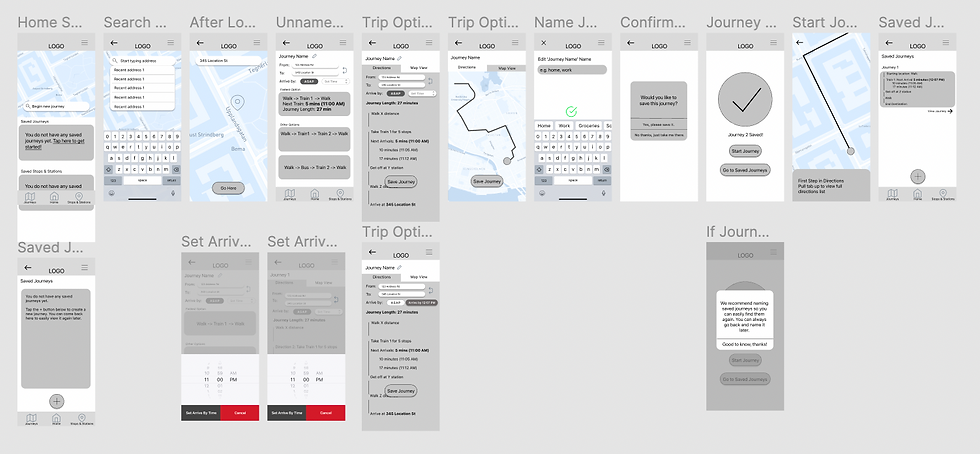
Screenshots of my greyscale wireframes created in Figma. Click the photo for the full PDF file (opens in new tab).
In this phase I started by designing my wireframes - it was exciting to finally see my ideas come to life!
I wanted to ensure that the critical red routes took as few clicks as possible to complete. Designing a transit app means you are designing for people on the go, and my wireframes needed to reflect that.
After completing my wireframes, I shared them with my design mentor for feedback, and implemented his recommendations to prepare for hi-fidelity.

Color palette from my style guide for hi-fidelity screens.
With wireframes completed, it was time to design hi-fidelity mockups. To prepare for this phase, I first created a style guide that included a color palette, font size guide, logo, and selected the icons and key elements I'd use in my design.
I also decided on the brand personality and brand mission to guide my UI + branding decisions.
If you've made it this far - thanks so much for reading! 🤓 Feel free to connect with me on LinkedIn or shoot me an email for feedback, opportunities, or just to say hi!

Example of hi-fidelity screens - click on the image to view the full prototype in Figma!
In designing hi-fidelity mockups, my goal was to simplify, streamline, and modernize the look and feel of the product. To do so, I removed the lower navigation bar, opting instead for an overlay window with tab options for Saved Journeys and Saved Stations.
Another way I achieved this was to reduce the number of screens users had to click into - for example, rather than have users click into “view all journeys,” they can see all saved journeys right there on the home page.
Finally, I updated the color palette to brighter hues of blue to give a more fresh and modern look and feel. After all of my screens were designed and pixel-perfect, I made the prototype clickable to prepare for usability testing.
Phase 5: Test + Iterate
For the final phase of my project, I conducted 2 rounds of usability testing + iteration. The first round was moderated and done via Zoom, while the second round was unmoderated via Maze.co.
For both usability testing roungs, I asked users to complete the following tasks:
-
Let’s say you want to visit 123 Address Rd. How would you get there?
-
Let’s say your Work commute is in the app. How would you get to work?
-
Please find and save the Columbia Heights Metro Station.
-
(From home screen) What are the next arrivals at the Columbia Heights Metro Station?
My goal was to determine how intuitively the user is able to pick up on the core functionalities of the application. After interviewing 5 users and reviewing the session recordings, I compiled my findings in a usability report (click here to read the report!)


Examples of changes I implemented from the first round of usability findings. Click on either image to view the full report.
Once I implemented the above changes to my prototype, I conducted the unmoderated usability tests. Users were asked to carry out the same tasks as in the first round, and were asked to provide optional feedback at the end of the session.
The unmoderated tests took less than 10 minutes to complete, and could be completed on someone’s own schedule, meaning that I got far more responses than in previous testing rounds. In total, 26 users completed my usability testing. Users averaged a 96% success rate on the tasks, and the feedback was overwhelmingly positive.
Due to time constraints on the project, I did not incorporate user feedback from the 2nd round of testing into my prototype. However in the next and final section, I’ll discuss recommended next steps + lessons learned for this product.
Conclusion + Next Steps

Final clickable prototype - those blue lines are so satisfying! Click the image to view in Figma.
If I had more time to work on PLANR, there are a few things I’d recommend for future iterations of the product.
First, I’d prioritize developing the in-transit interface + experience. In other words, what do the directions look like as users are in transit? Does the app notify them while they’re on their trip? How do the directions change/update with each step?
I’d also revisit some of the features that I brainstormed in the Ideation phase, but decided not to include in the MVP. For example, I’d try testing out a scheduled journeys feature, where users can schedule trips they take regularly in the app - for example, their daily morning commute, where they have to be at work by 9 AM every day - and incorporate notifications that let them know exactly what time to leave every morning.
Additionally, I’d look into incorporating 3rd-party provider integrations, like Uber and Lyft, or bikeshare and scooter shares, which are very popular here in DC.